
flow cafe
Refining identity through subtraction: translating fluid sensory experiences into a premium, minimalist brand asset.
00

My Role
Led the visual strategy from inception, establishing a "minimalist, contemporary, and sensory-driven" brand identity. Successfully synthesized diverse product lines (coffee and ice desserts) into a highly recognizable, geometric design language.
Impact & Results
The gallery-like visual language combined with meticulous print craftsmanship successfully positioned a casual dessert cafe into a premium lifestyle brand, effectively attracting discerning consumers and driving a higher price premium for the products.
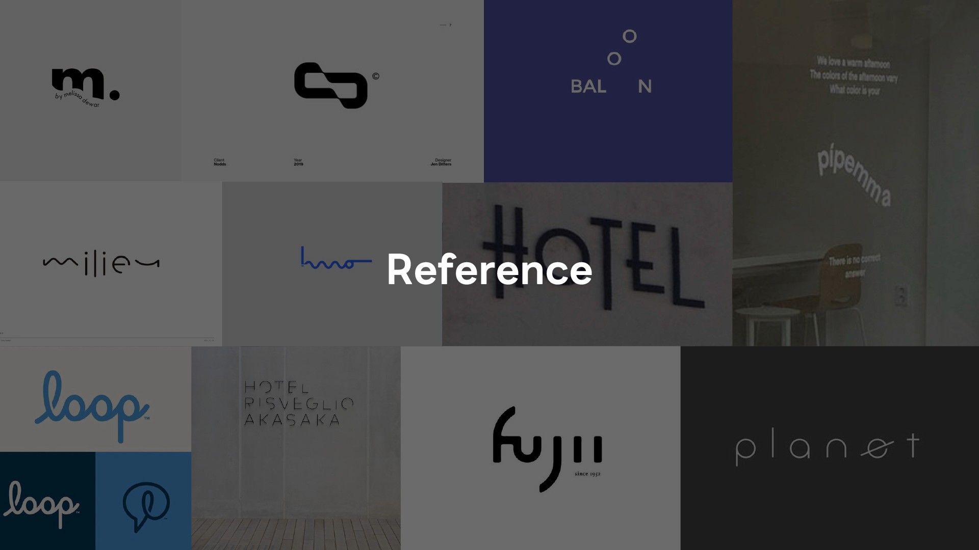
Developed for the coffee and dessert brand "FLOW (flowice)," this visual identity seamlessly merges minimalism with modern deconstructive aesthetics. It cleverly translates the fluid movement of ice and confections into a clean, serene visual experience reminiscent of a contemporary art gallery.
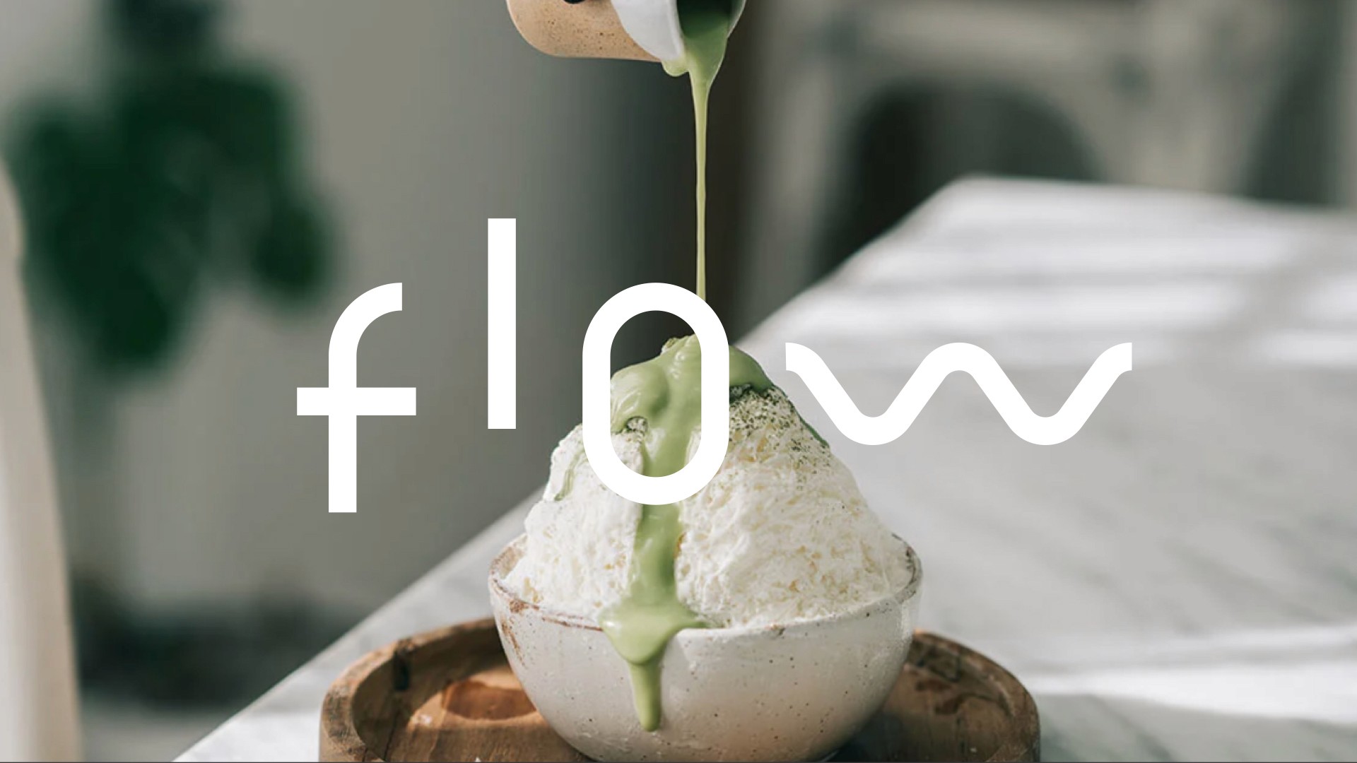
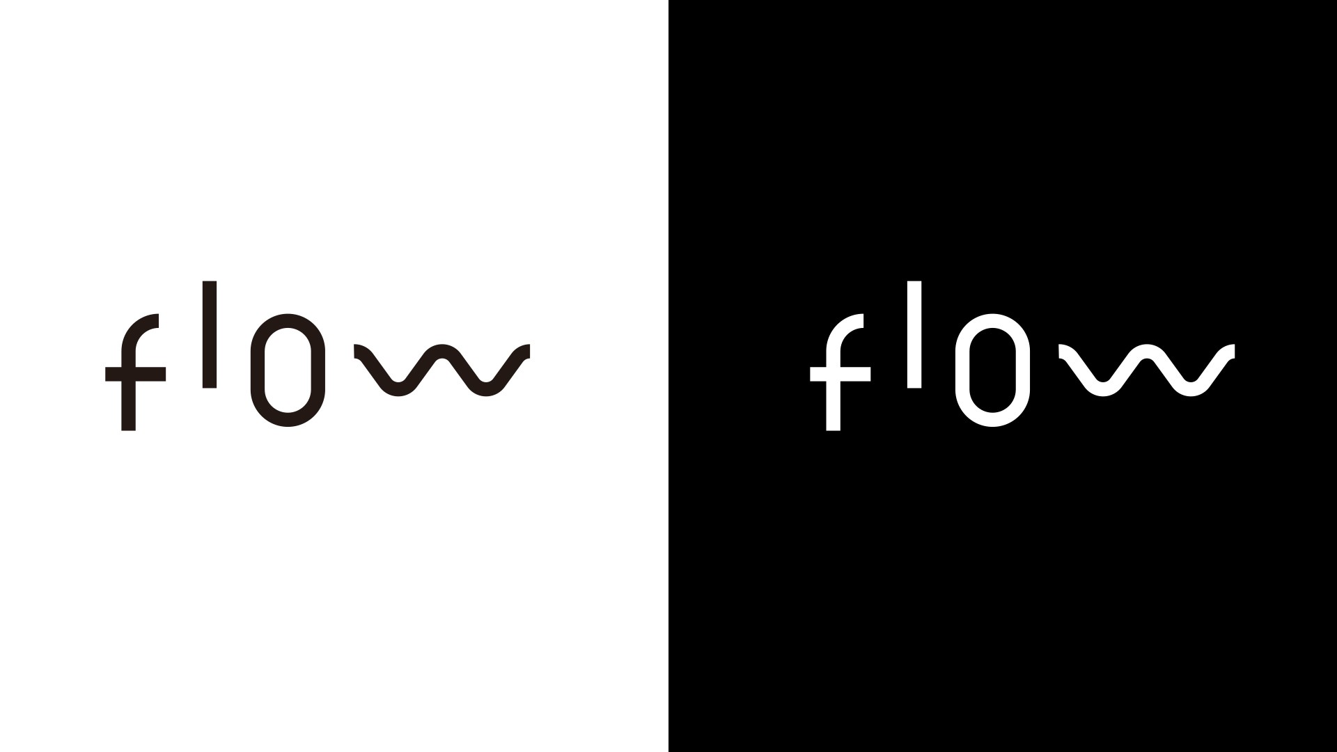
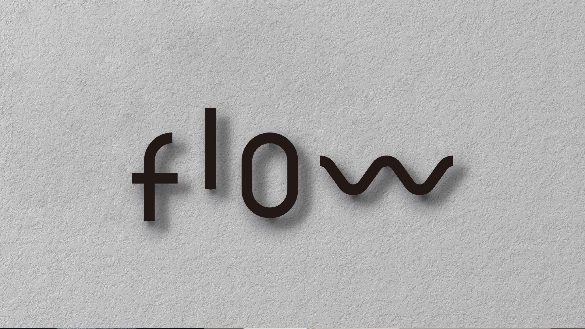
Balancing Geometry and Emotion: The letters f and l utilize sleek, sans-serif geometric lines to establish a rational, architectural framework, while the elongated, oval o creates a focal point of negative space, evoking the imagery of a vessel.
The Fluid Signature: The defining feature of the logotype is the substitution of the letter w with a fluid wave symbol. This graphic element perfectly embodies the brand’s soul, capturing the dynamic motion and melting texture of cascading matcha or velvety cream.
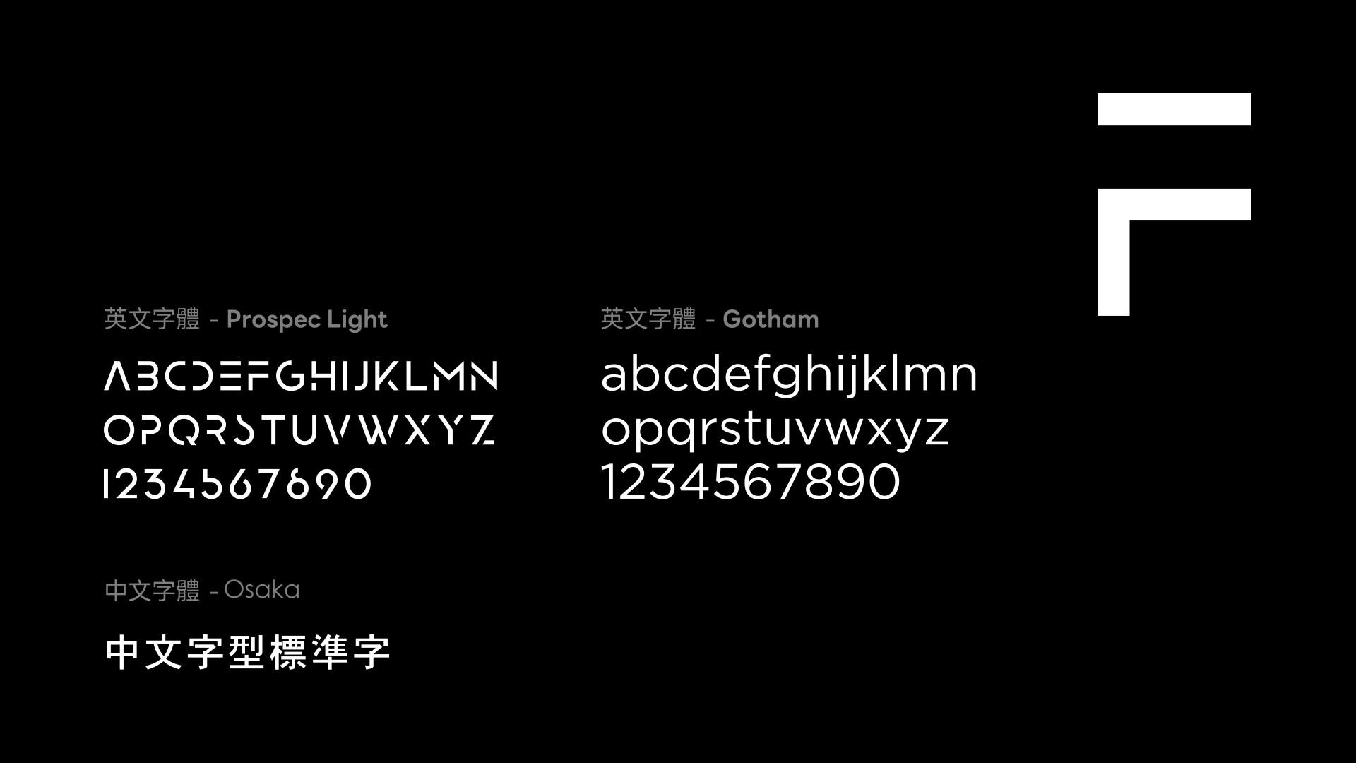
Latin Typography: The typographic system pairs the classic structural stability of Gotham with the futuristic Prospec Light, whose stencil-like cuts echo the deconstructive language of the primary logotype.
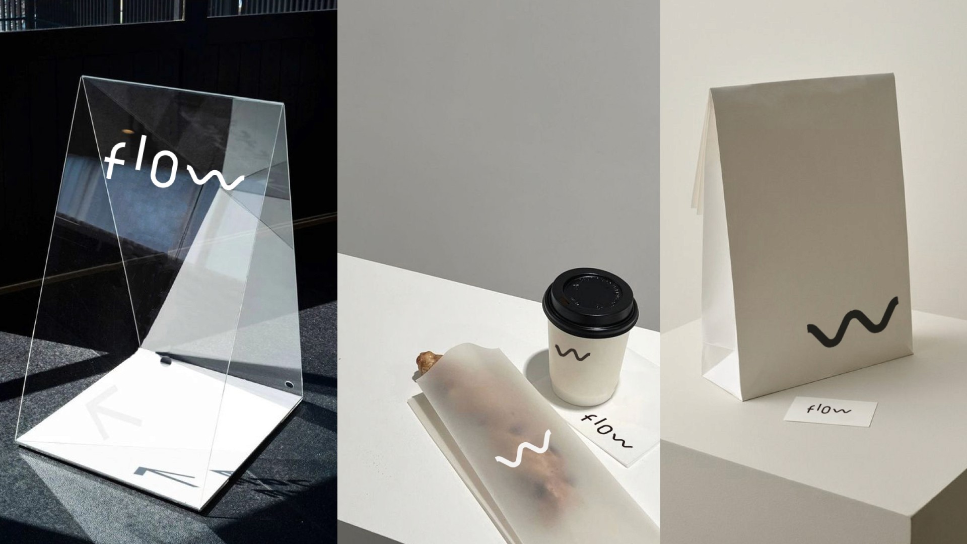
De-branded Iconography: On cup sleeves and takeaway bags, the wordmark is intentionally omitted, leaving only the iconic "wave" symbol. This subtle branding approach elevates the symbol into a powerful visual asset.
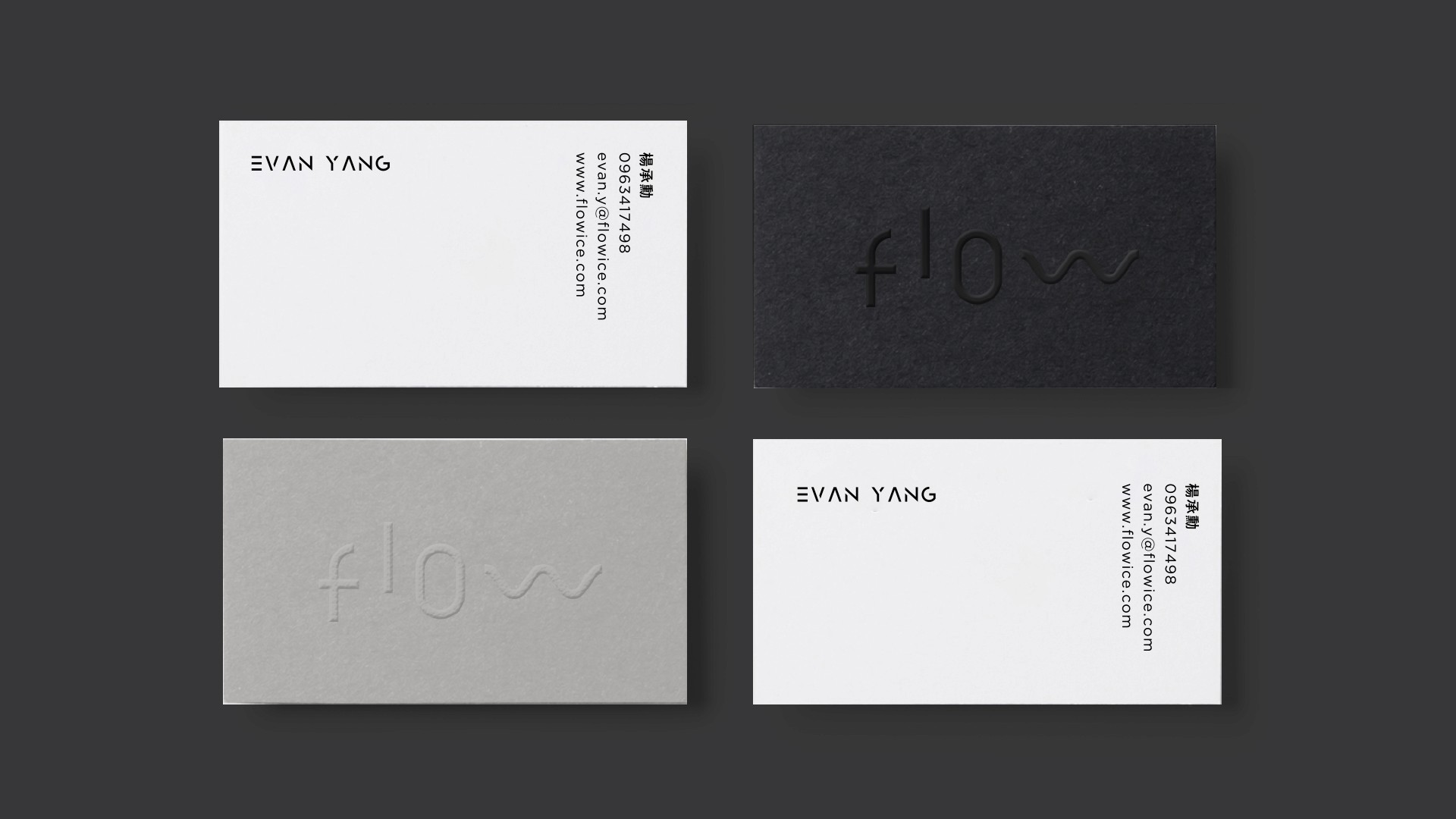
Materiality and Tactile Experience: The physical touchpoints prioritize tactile contrast and premium craftsmanship. The business cards feature heavy-stock paper finished with blind debossing, using light and shadow to reveal the logo with understated sophistication.
year
2026
tools
Adobe Illustrator / Adobe Photoshop
category
Branding and Identity


