
Donation Icon Design

Project Overview
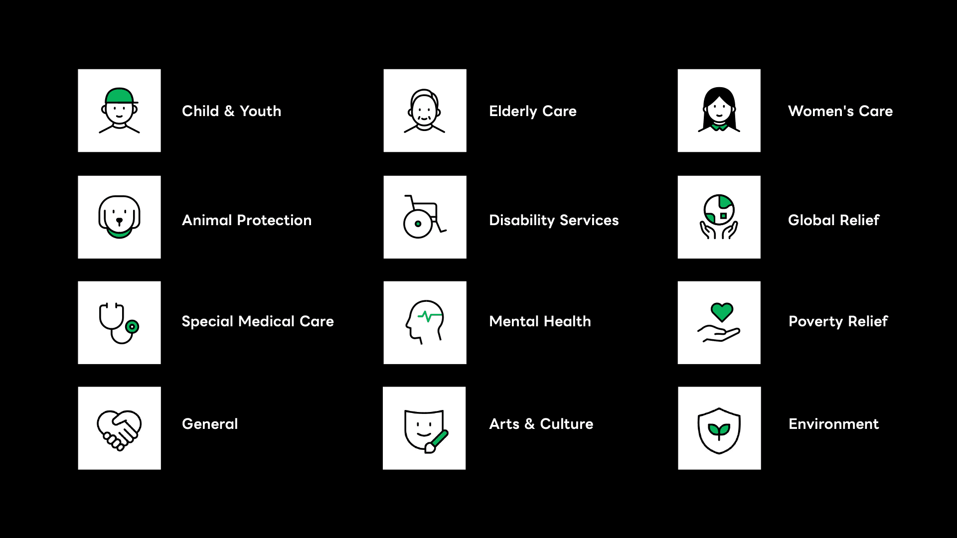
In digital product experiences, micro-visual elements bear the crucial responsibility of guiding user behavior. This project features a comprehensive core category icon system designed for a charitable donation and fundraising platform. The primary challenge was to infuse line-based geometric iconography with emotional warmth while ensuring maximum glanceability, visual balance, and scalability across cross-platform (App/Web) responsive layouts.

Visual Vocabulary: Geometric Structure, Softened with Warmth
The entire icon set utilizes a uniform stroke width and a modern geometric framework. However, a specific corner radius was applied throughout to soften the aesthetic, making the digital product feel less cold and more trustworthy.
Strategic Accent Color: A vibrant, life-affirming green is used as a deliberate visual anchor. It captures the user's attention instantly during rapid scrolling, seamlessly driving intuitive navigation.
Micro-Copy & Visual Harmony: Alongside the iconography, the micro-copy was streamlined down to 1–2 word labels (e.g., Disability, Advocacy, Others). This optimization ensures clean visual breathing room and an efficient information hierarchy, preventing user cognitive overload during browsing.
This project was more than a graphic design exercise; it was an interface optimization initiative aimed at driving real social impact. Through seamless UI and interactions, the design shortens the distance between donors and those in need—ensuring that every single tap feels intentional, reliable, and meaningful.
date published
Nov 29, 2025
reading time
5 min read


