
EWE Global Express Brand Design

A comprehensive brand visual redesign for EWE Global Express, a Sydney-based logistics brand. By restructuring the brand identity, typography, and extended applications, this project delivers a faster, more tech-forward, and international brand image.
Design Concept & Core Strategy
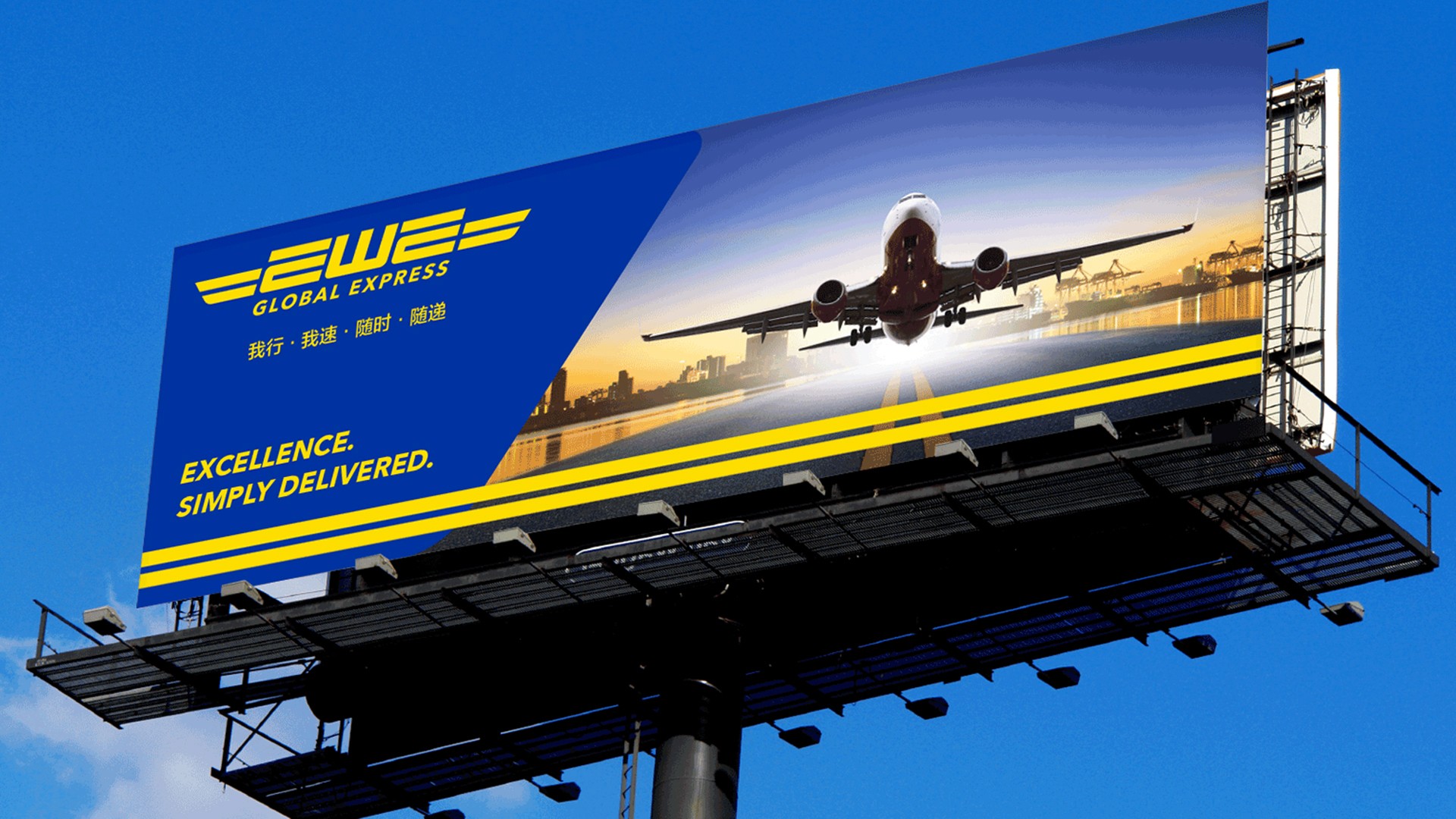
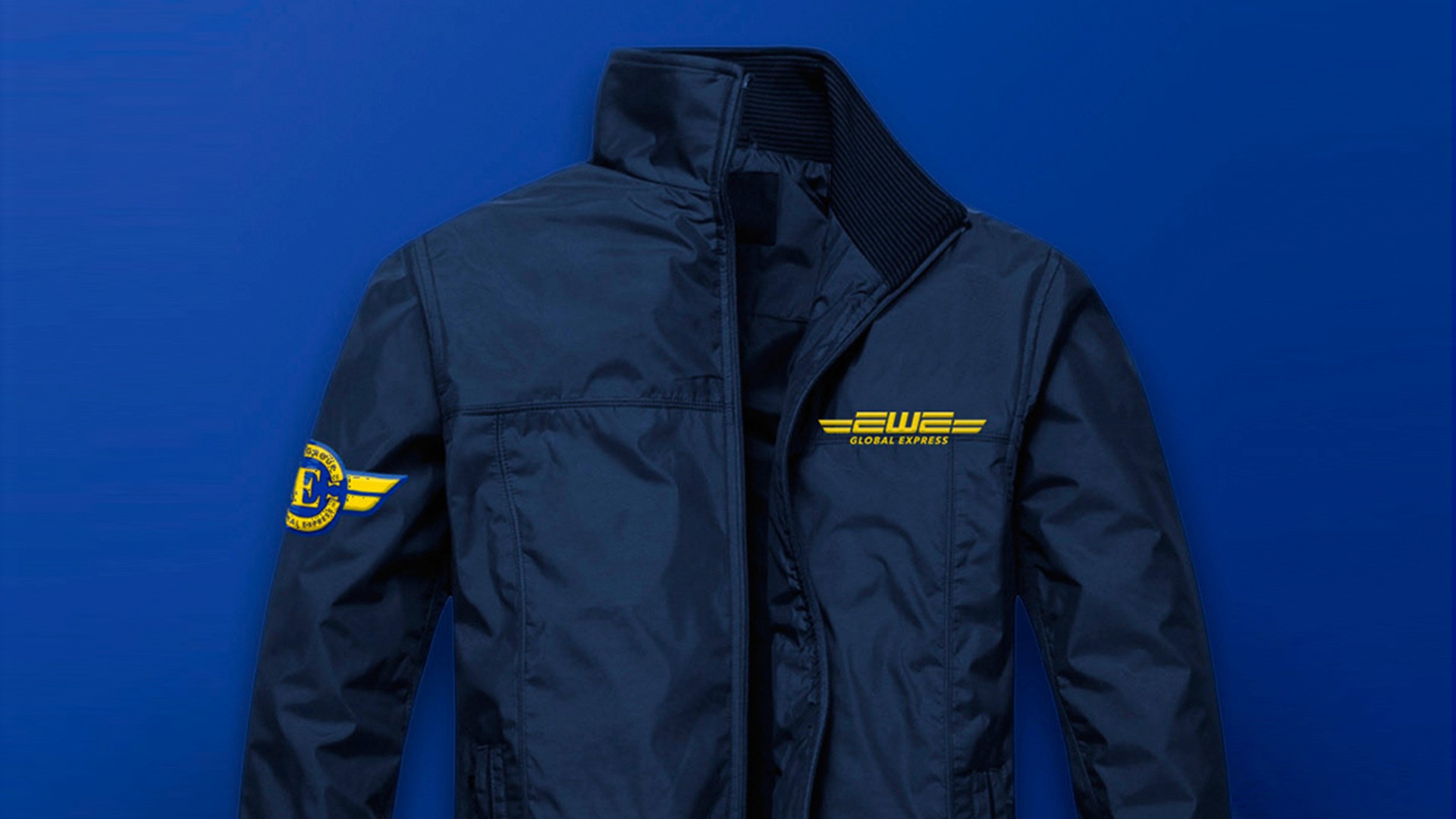
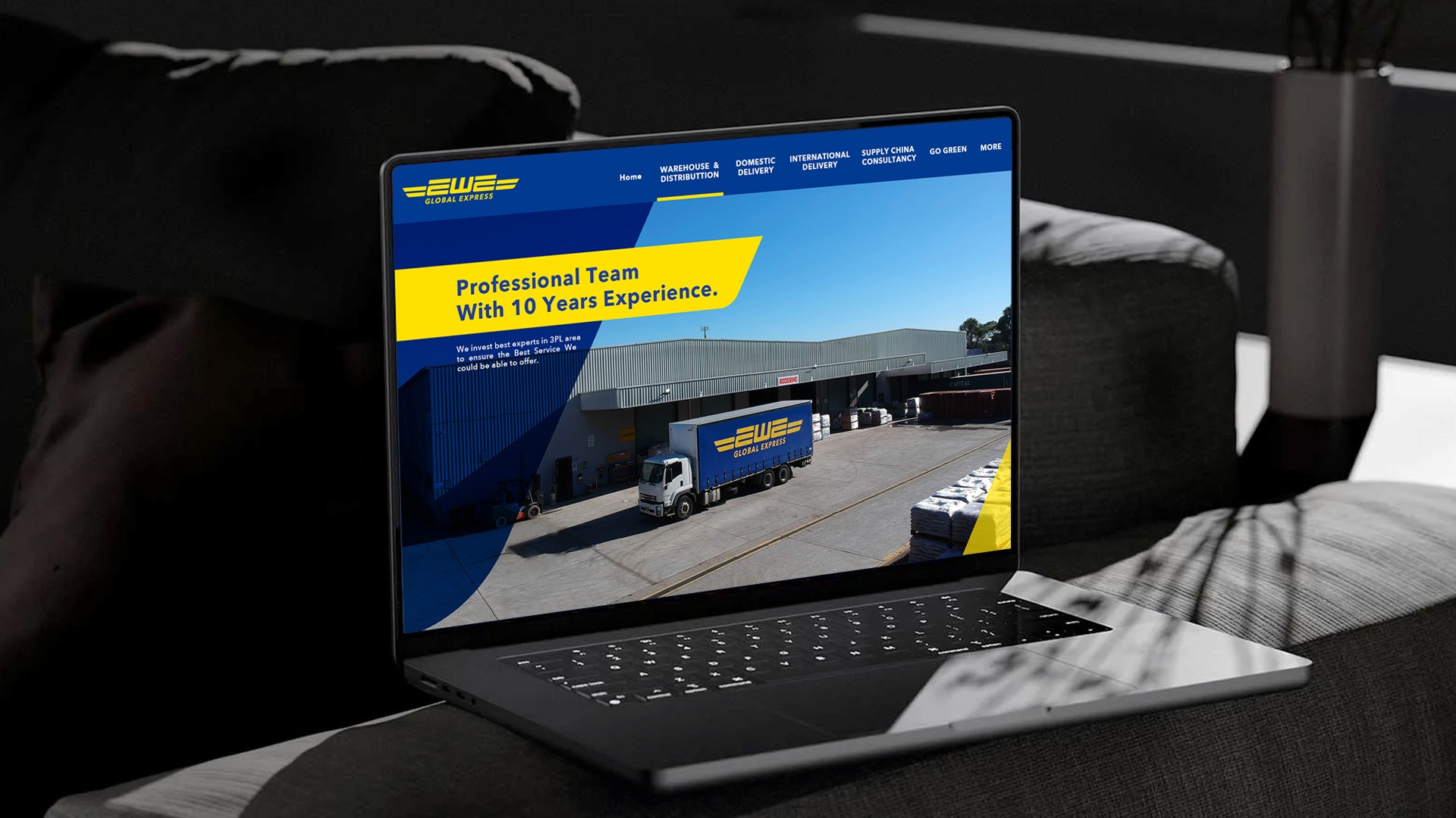
With "Global Express Delivery" as the core concept, the design evolves from the brand’s original foundation—retaining the recognition of EWE while using more streamlined geometric structures and dynamic slants. This reinforces the visual impression of "high-speed transit" and "cross-border connectivity" essential to the logistics industry. The primary palette features a high-recognition blue and yellow color scheme, establishing a vibrant and trustworthy brand personality.
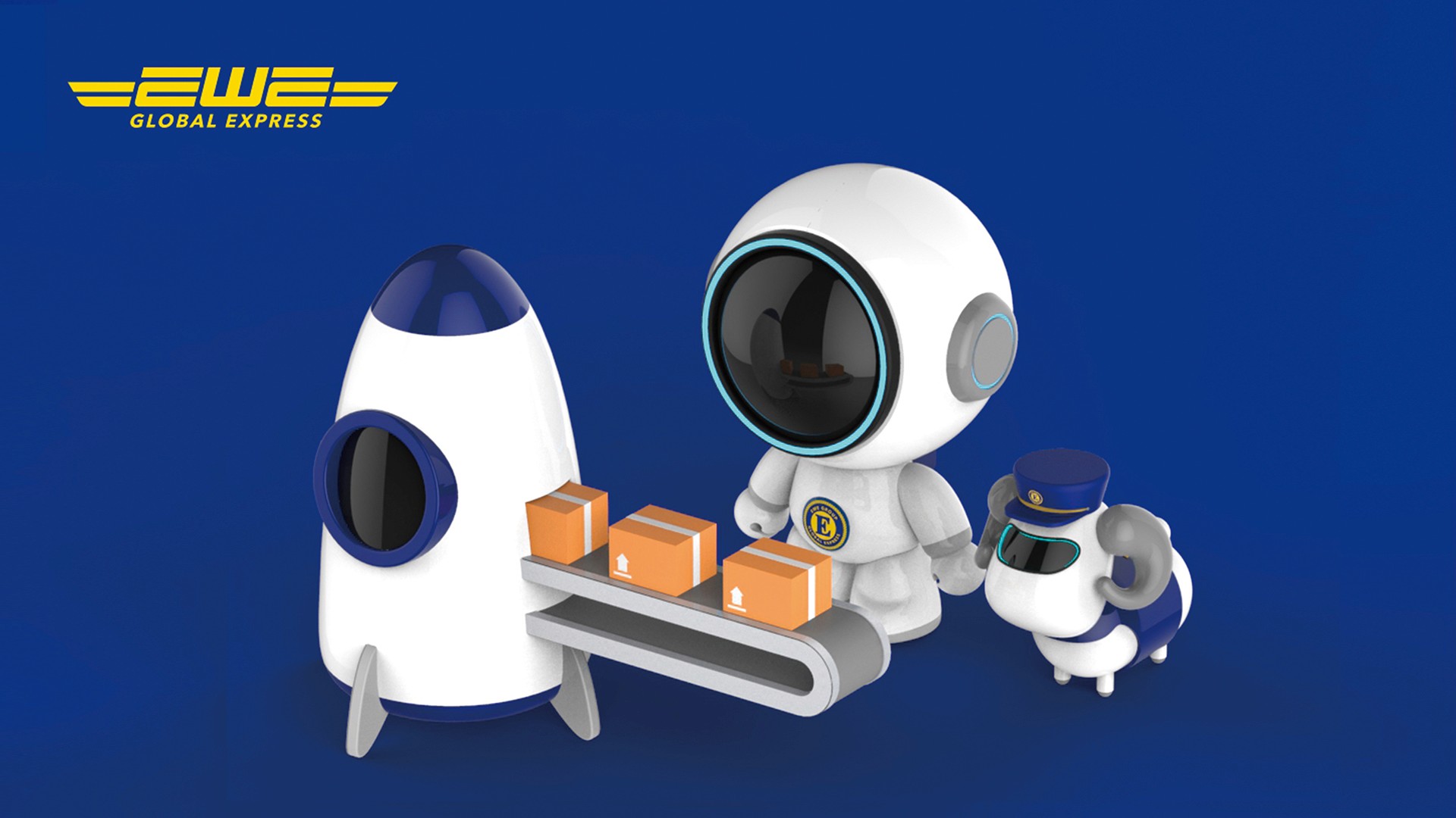
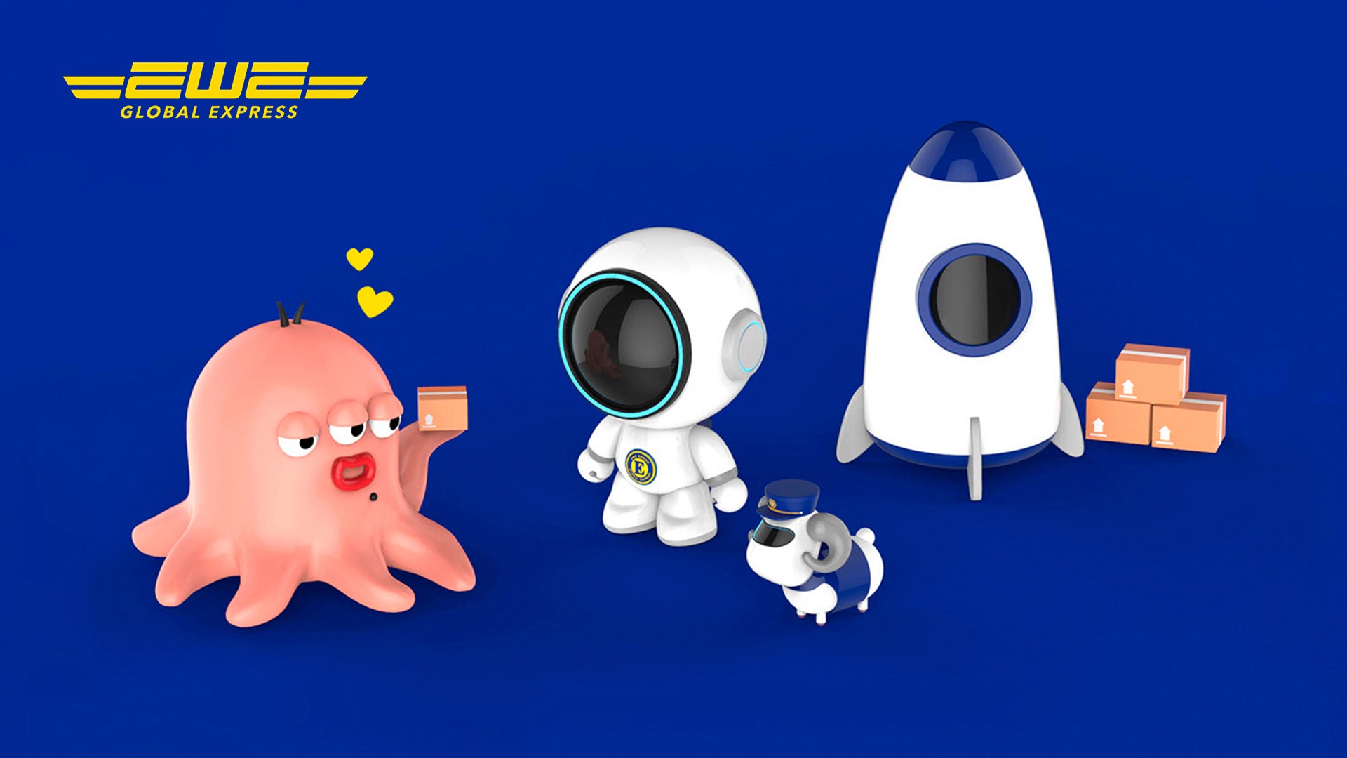
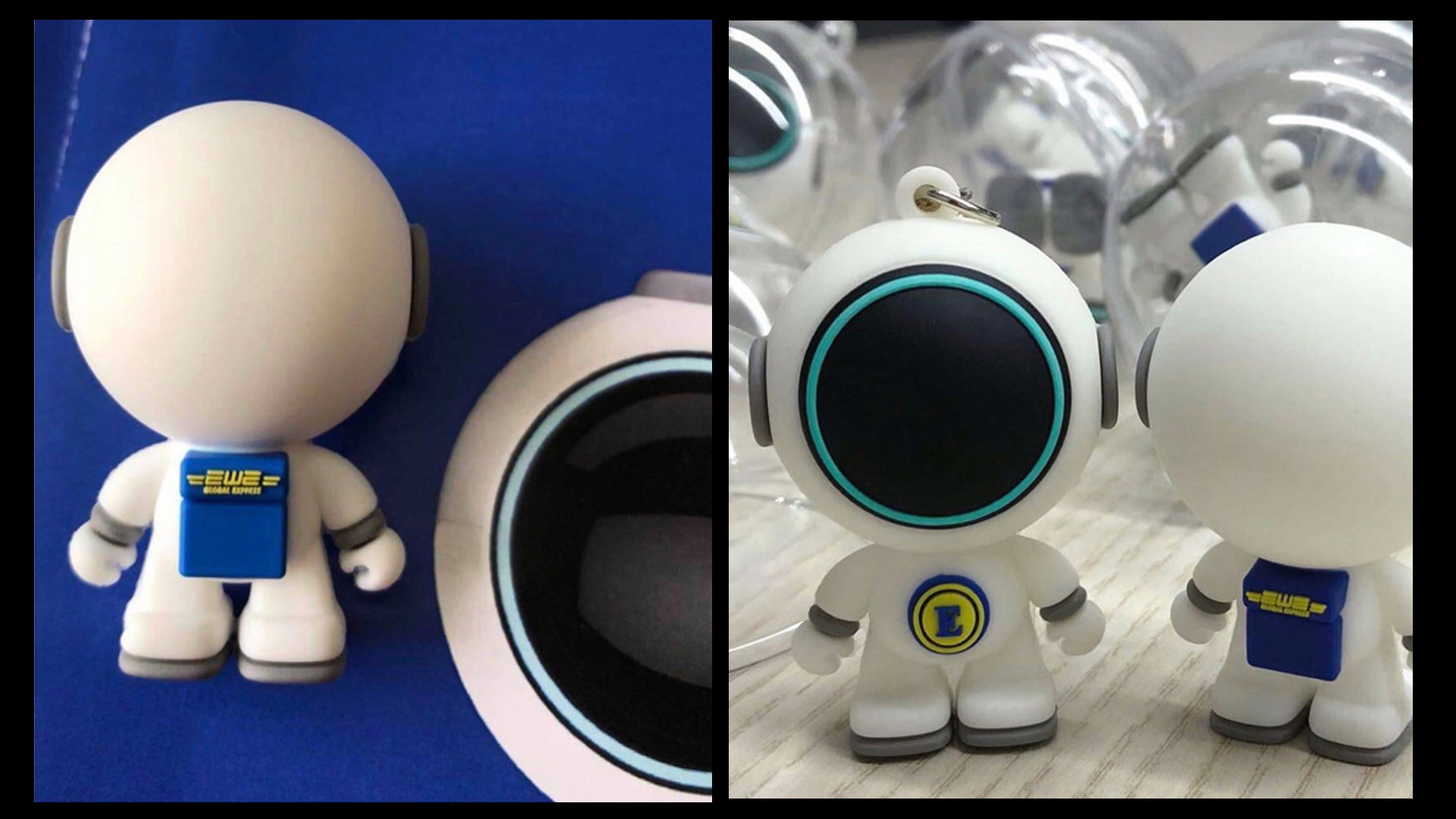
Brand Mascot (IP Character) System
Beyond restructuring the brand identity, we simultaneously developed a brand-new IP character system: "The Outer Space Courier."
The Core Concept: "No matter the distance, we deliver at rocket speed."
This translates functional logistics services into a more memorable and approachable brand language. Incorporating astronauts, rockets, and futuristic elements injects a sense of fun and emotional connection into a traditionally functional freight brand, while significantly boosting brand recognition on social media and among younger demographics.
This redesign goes beyond a mere logo update; it redefines the very personality of EWE Global Express. It transforms logistics from a basic shipping service into a faster, more engaging, and warmer global connection experience.
date published
Feb 28, 2022
reading time
5 min


